In this article, you will be able to see the results of a study in which we analyzed the websites of fourteen creative and marketing companies, as well as best practices and recommendations for creating a website.

We analyzed the home page, dividing it into three parts, the hero page, the sections below the hero page, which we called home page sections, and the footer.
List of website links:
fivebyfiveglobal.com
sensisagency.com
netpeak.net
dsfriends.digital
hubsanfrancisco.com
poweragency.com
wearetraina.com
sidlee.com
powerdigitalmarketing.com
disruptiveadvertising.com
uplers.com
seobrand.com
madfishdigital.com
adwise-agency.com
Decomposition
a. Navigation Bar
In this section, I will break down the navigation bar. Good navigation is one of the most important features of a website.

Thirteen out of fourteen websites have more than one page. Only fivebyfiveglobal.com have a slider structure.

All selected websites have ABOUT and CONTACT sections, but only 6 have the button highlighted.
Thirteen out of fourteen websites have a BLOG category, sidlee.com does not have a shortcut button in the navigation menu.
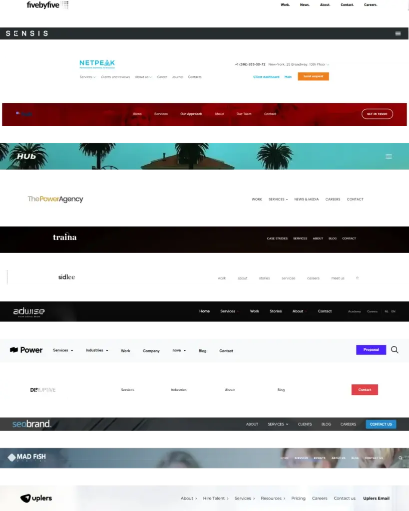
As you can see, all websites use the navigation bar. This is an indispensable element of any website. It increases the time a visitor remains on your website by exploring and discovering more information.
Another reason to use a navigation bar is the concept of Serial Position Effect, which explains how a person gives more importance to the first and last part of a website. That’s why it’s good to have very important shortcuts in the navigation bar.
We also note that the best practice is to position the bar at the top of the site.
If we choose different positioning, we have to do it consciously and carefully because the user might feel confused or even frustrated because he can’t find the desired information.
Navigation Menu Elements
Hamburger menus have grown in popularity in recent years. When to use them and when not to?
According to the article “The ultimate guide to the hamburger menu and its alternatives”, 25% of apps are deleted after the first use because users can’t find all the features of the app.
Given this statistic, don’t hide important features in a menu of this type. As for positioning, menus placed on the left side have the lowest click rate.
With the hamburger menu, you create a cleaner and more recognizable UI.
Highlighted CTA or not?
We all know that CTA buttons boost conversion. Only six out of the fourteen websites selected for our research use a highlighted CTA in the navigation bar.
It follows that the CTA button in the navigation bar is not considered an important element through which they convert.
Why wouldn’t they use this technique?
Should I add the search option?
Giving the users who visit your website the option to easily find the information they are looking for is very important. Adding a search option decreases the bounce rate, but as you can see only two of the fourteen selected sites use this feature. If your content is easy to find, you may not need this costly development option.
b. Hero Section
Next, I will break down the hero section.
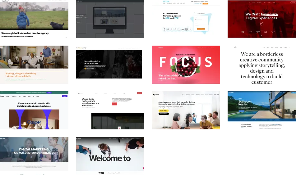
Video

According to vidyard.com, your website has exactly 0.05 seconds to make a good impression on your visitor. 94% of first impressions are design-related.
Not so long ago, videos on websites were considered a nuisance. Their quality was poor and there was a risk that the user would instantly leave the site because of the sheer volume of auto-play videos.
With the evolution of technology, the way we integrate videos into a website has also changed. The quality has increased and the volume can be adjusted so that the user experience is a pleasant one.
According to theedigital.com
- Internet video consumption has grown on average by 32% annually between 2013 and 2018. Consumption is expected to grow continually within the next few years.
- 85% of internet users within the U.S. consume content through online video
- In 2021, the average person watch online videos for 100 minutes every day, an increase from 84 minutes in 2020
- Internet videos will comprise more than 82% of total consumer internet traffic by 2022
Landing page videos are all about conversion, pair them with a CTA.
Videos can attract visitors, keep people on your site, build trust, stand out from competitors.
Increase traffic by sharing your videos on social media.
Text

Titles are aligned left or centered. Eleven use sans serif, bold fonts, and only two use serif. Nine are aligned left and four are centered. We can observe the four that are aligned in the center are larger. Seven websites have more than the headline on the home page, usually linking the headline to a value proposition.
CTA Buttons
A call to action (CTA) is an invitation on a website that tells the user to take a certain action. Generally, a call to action takes the form of a button or a hyperlink, but nowadays you can also find them in videos.
Some CTA goals:
- Contact
- Reserve
- Buy
- Learn
- Download
- Share
- Sign up
Nine out of fourteen use a CTA button. Disruptive is the only website that showcases their company in video, where they also used call-to-action.
Every audience responds differently. There is no guarantee that one call to action will perform better than another. To find out how much better it performs than another, we need an A-B test.
In conclusion, we can see that for these creative and marketing agencies, converting with a CTA button is not that important.
If you think you know of a reason why these companies don’t use CTA, feel free to leave us a comment below.
But you should never underestimate this button that can give you the following:

and that’s not all. A CTA can establish a connection between the customer and the company, reduce customer stress and frustration, faster location of products and services.
We understand your requirements and develop them further. For more success.
At epoint.digital, we specialise in providing innovative marketing and technical solutions tailored to the specific needs of the your industry. Our expertise spans digital marketing strategies, web and app development and IoT integration. We help our clients navigate the complex landscape of modern world and achieve their goals for operational efficiency and market growth.

c. Home Page
Here you will read about all the sections on the home page below the hero page. I’ll take each site individually and list the sections on the landing page, adding a few details for each. The Footer section will also be excluded from this list.
fivebyfiveglobal has three sections.
The first section showcases their work, the second features their most recent blog posts, and the last section covers other projects they are involved in and strong relationships with other companies.
Observations: They have lots of images on the site, each from different categories. To create consistency, they’ve ditched the saturation and created a black and white environment that comes alive when you hover over it by coloring the image.
sensisagency has four sections.
In the first section, they describe their values in a few sentences, focusing on their intercultural experience. In the second, case studies are presented, and the third section presents two studies conducted by the company, one on Boomer culture and the other on Generation Z. The last section presents their latest blog posts.
netpeak has twelve sections.
They start with the CEO’s manifesto, then continue with a list of companies they have worked with. In the third and fourth sections, they present the services they offer and what differentiates them from the market. The fifth section is dedicated to their product companies, and the sixth present their areas of expertise. In the seventh section are the projects they have worked on, followed by testimonials, team presentations, career opportunities with their company, and events. The last section shows the latest blog posts.
Observations: They have video testimonials. The videos are not perfectly shot, they have a natural look and usually, the interviews take place in the client’s office.
dsfriends.digital has a slider format.
Each of the slides contains the following: services, approach, about, team, and contact.
Observations: The website is well designed, with good consistency. They use stock photos of happy people, but they break this consistency when it comes to company members’ photos, where images look more natural.
hubsanfrancisco has only three sections.
The first one presents their approach, then follows a section with lots of projects, each of them presented on another page as a case study. The third section presents the clients they have worked with.
Observations: In this presentation site, they focus on the projects they have worked on, showing so many case studies.
poweragency like the one above has few sections.
They start with projects they’ve worked on, then add a human touch to the company’s image by sharing their social media posts in a friendly way (featuring company events or funny moments about the employee and their pets).
wearetraina has six sections.
The first section is “About Us”, followed by their work and clients. This is followed by the services section and an overview of their studio. The last section displays the latest blog posts.
sidlee has five sections.
They start with a video showing impactful moments alongside the text, creating emotion. The second section is dedicated to projects, the third section presents the services offered, and immediately afterward the company’s story is presented. The last section is with the latest blog articles.
powerdigitalmarketing has six sections.
They start with a CTA for case studies. The second and third sections contain lists of clients and testimonials. The next section is about services, technologies used and differentiation, followed by a “Get a proposal” CTA. The last two sections feature two ways they can help you and their latest blog posts.
disruptiveadvertising has six sections.
The first part is the client list, followed by the company and team awards. In the fourth section, they list their services, each with a “Get Audit” CTA and how they can support you. In the last section, they have their latest blog posts.
Observations: They use a CTA every chance they get.
uplers has six sections.
In the beginning, they introduce the services they offer. The second section, testimonials, caught my attention because some of them are videos taken in the personal office or at home with the children, which gives a natural and friendly feeling. The third section offers more information about the company, a CTA button, and a block of numbers. The following sections feature clients they have worked with, how to engage with them, and case studies.
Observations: The only site that uses a Chat, positioned in the bottom right corner, and sometimes they stop you with a pop-up that contains a CTA.
seobrand has five sections.
The first section presents the services, then the awards, a case study, the client list, and the last section is the blog.
madfishdigital has six sections.
Just like seobrand, they start with services. the next section is a headline with CTA, in the third section they show the industries they work in, in the fourth are case studies, followed by company values and latest blog posts.
adwise-agency has four sections.
They start with the about us section. The second section shows projects, the third is the latest blog posts, and the fourth shows the company’s services.
What did we observe?
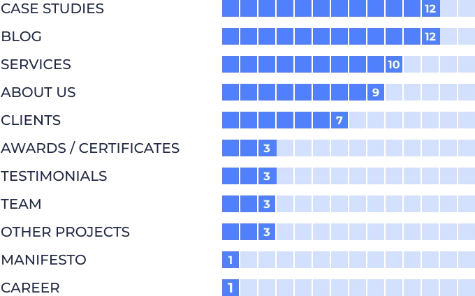
These figures show that for these agencies, case studies and blog content are the most important sections.
Case Studies
As you can see, twelve out of fourteen sites use case studies on their home page.
A case study is a summary of a project your company created to show how effectively you solved the problem the customer came to you with.
Some benefits of having a case study section on your website:
- Give you the chance to present your results through a story
- Build credibility by showing results.
- SEO
When you want to create a case study, you need to think about the environment in which it will be displayed to choose a format.
In terms of structure, it should contain a challenge followed by a solution and results.
Try to grab attention with the title and keep the language as simple as possible. Add real figures and at the end create a pleasing design.
Blog
Why is it important to have a blog?
Generally, the blog is displayed in the section at the bottom of the home page, but we’ll talk about it and the benefits of having one first since it’s the most common section in this study. A blog brings traffic and promotes your products and services, but not only that.
It’s one of the ways you bring in traffic, further generating leads. For that, you need to optimize your site for search engines. You can create connections and keep in touch with your audience by posting company news or promotions or you can publish your content on social networks.
Services Section
We find them presented in ten of the sites. Services are another way to convert traffic into leads.
Unlike products, which if they have a problem can be returned, services require trust. They are offered to people or businesses, and the negative impact should be avoided, being more personal.
There are two types of service display, one where you present everything on the main page, and another where you provide a link to a page where you go into more detail. An overview of what you offer is good for new visitors, but we recommend you to have both a brief presentation on the landing page and a link to more detailed information about what you offer.
About Us
This is your story, and people love stories.
If only nine out of fourteen websites have this section, for you is mandatory. Here you show how you started and where you are today and what obstacles you have overcome. You can highlight your values and show what makes you different.
This part is usually found at the top of the site. As with services, you can make an overview on the home page and create a button with a link to a page with more information where we recommend you to use images or videos.
Some tips when writing your About section:
Use your brand voice
Include employees in the story
Think about conversion
Offer some technical information
Make videos.
Clients
Seven sites have a section with the logos of the companies they collaborated with.
Why should you have this section on your website? This category helps you to build trust between you and your visitors. Let’s say you’re a small company, but luckily you got a contract with a Nike promotional campaign, displaying their logo will give your company a significant boost.
Always present brands that are familiar to your audience, don’t make them stand out too much, to do this you can present them in black and white, but never use other colors. A company’s logo carries its voice and values and you don’t want to do that.
Awards and certificates.
Embrace your success.
Your company’s awards and certificates are the results of hard work and effort, so be proud of them and don’t forget to mention personal or employee awards.
Awards and quality marks can boost your reputation and gain trust.
mindtools.com have done a study on this topic and the results are the following:

But be careful, chasing awards can be costly and in some cases damage your reputation rather than enhance it.
Testimonials
More elements to builds trust.
netpeak, powerdigitalmarketing, and uplers use testimonials section on their website.
powerdigitalmarketing has text testimonials, uplers.com combines text with video and netpeak.net has only videos. The videos are made with a webcam in the office or at home, even with the kids around, which gives a human, friendly touch.
It is recommended that this section appears on your website as a trust element. They can act as a referral system and, as mentioned above, create an emotional connection.
Team
Another element that affirms that your company is trustworthy. By introducing your team you create a connection with the visitor, showing that there are real people behind your company.
There’s also a negative effect. Showcasing your best people, you run the risk of losing them.
Manifesto
netpeak is the only one showing the manifesto on the website.
“A manifesto is your brand’s Magna Carta, Rosetta Stone, and Declaration of Independence all rolled into one; it’s the halftime locker room speech given by the CEO; the words of the founder heard on the mountaintop before bringing down the stone tablets. Reading a great brand manifesto should make you wanna run out and try the product. You should feel the brand fire in your bones.” Luke Sullivan’s definition for manifesto.
By having a manifesto, you create a link with everyone who engages with your company, you show your company’s intentions, show the tone of your brand and explain how you are making an impact in the world.
When writing one, you must answer the following questions:
What do you stand for?
What do you stand against?
The manifesto doesn’t just have to appear on the website, you can also add it to mailings, brochures, or other items.
Adweek recently conducted a study looking at the evolution of marketing since the pandemic. It shows that “68% of respondents said the role of marketing has been elevated in the past three months” and that “business leaders are more responsible than ever for being agents of change”.
Career
netpeak is the only website that uses the Career section.
This section is not as important as the ones mentioned above, but it has its benefits, especially if you want to make a hire. I say that because this section is not necessarily designed to find new people.
Some benefits of having a Career section:
- Reduce time and costs
- Makes the hiring process easier
- Shows your brand image
- Provides reasons to join your team
- Reduce HR pain

