No more cues, passport and other pictures made simple
The Problem
We need an e-commerce solution for editing and managing biometrical pictures that are needed for institutions, CVs, employee badges that can be rolled out on a global scale.
This was the challenge that was initially presented to us.
Discovery
We started by defining, together with the customer, the target audience.
There were 2 different business cases identified. A B2C focused solution and a B2B solution —the latter should be extendable from the first— that would allow integrating the software in other environments while managing the editing and printing of photos centrally.
Quite soon in the discovery process, we identified that a new identity was needed. The old logo was too playful and the colors used in the Corporate Identity did not match the audience. Also, we needed something more trustworthy for an international rollout.
The interface needed to be responsive and perform well on smartphones —as almost all solutions nowadays— multilingual and multi-currency.
Solution
We needed to create a solution that can be easily used by End Users to cover the B2C market and allow the frontend (photo editing functionality) to be integrated into the partner sites or intranets while allowing some brand customizations for the B2B market.
Create a new identity starting with a Logo creation (CI/CD).
Identify the necessary user flows, as well as backend processes. Design the User Interfaces (UI) as well as create an enjoyable User Experience (UX).
After the design stage, we created User Stories and bundled them into Releases, for better management.
Release I — Frontend Editing and Content Management
Release II — E-commerce capabilities (backend)
Release III — B2B frontend integration in external sites and custom Branding
The recommended technical solution was to build a “decoupled” system that can be later migrated to a PWA and also rolled out as Native Apps. We chose Vue.js for its low learning curve and a strong community.
For the backend, we decided to use an open source e-commerce framework like Drupal Commerce rather than build on a low-level framework.
Information architecture
The first Phase was kicked off by analyzing the Target Audience.
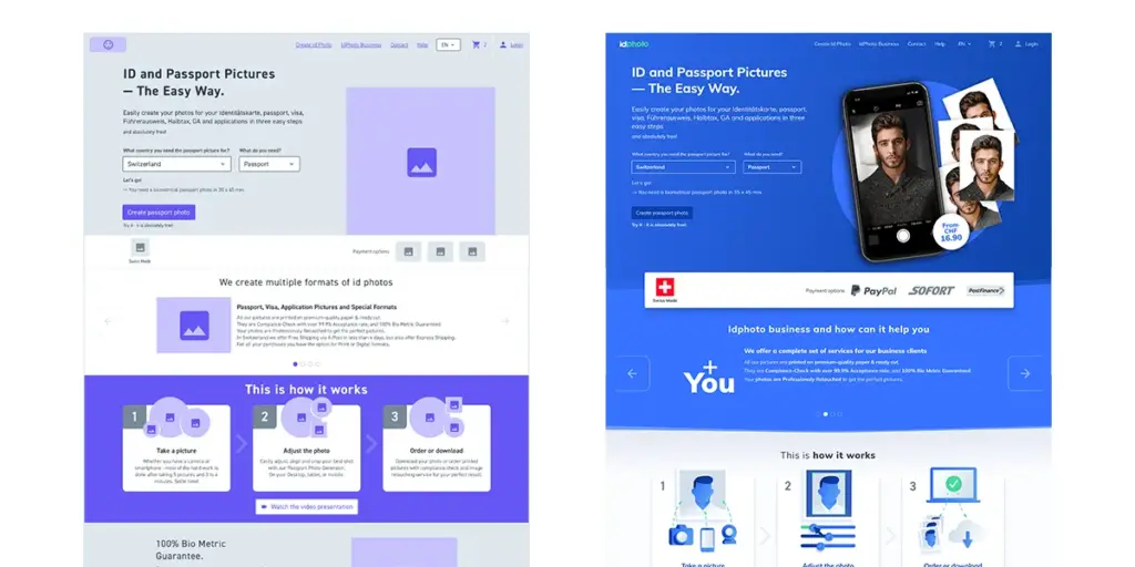
Based on the Target Audience we identified the User Flows that were required, and translated them into wireframes.

Branding
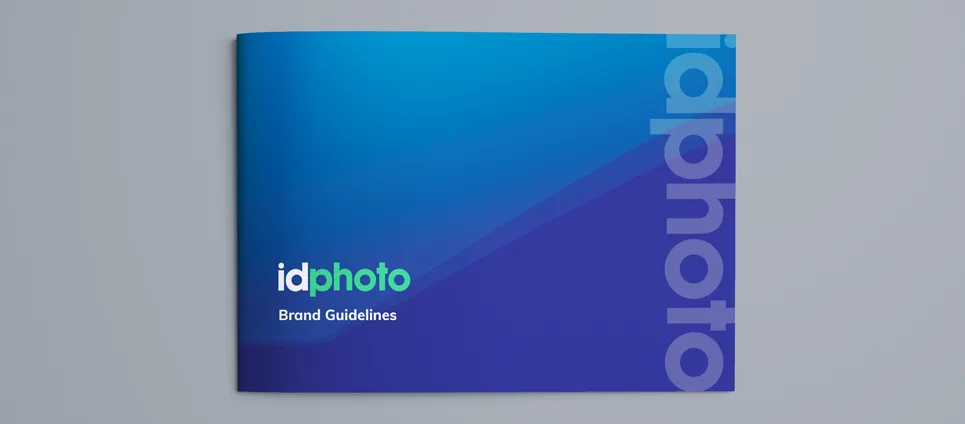
Following our Creative process, we took into consideration the 3 stages of Logo design. We developed a new logo with 3 iterations, that were discussed and we settled on a logotype, it having much more readability and more in line with the new target audience.
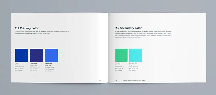
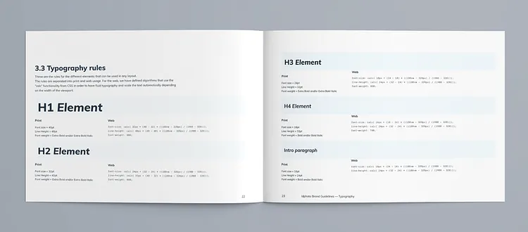
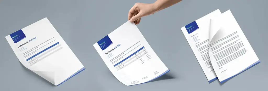
The new logo set the tone of the entire CI (Corporate Identity) resulting in the Brand Guidelines book, that set the rules for all major elements of the CI.


UI / UX Design
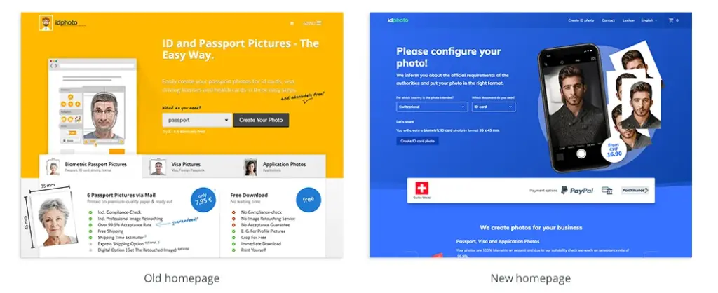
The new identity ensures a better success rate with the newly defined target audience, by moving away from the yellow —mostly associated with fun and playful— to the new color palette.
All elements —graphics, fonts, user interface and images— were completely redone to stay in tune with the new CI. Based on the wireframes and with the rules set in the brand guidelines we redesigned the User Interface.
The new user interface design was created with a “mobile first” approach in order to have the best user experience on any device.

More than 210% growth in turnover and a tripling of profit from advanced multichannel strategies.

DANIEL BANICA
ACCOUNT MANAGER
Development
We started with developing the frontend with its photo editing capabilities and built an easy to use, responsive solution that behaves almost like a native app.
Launching languages and translating the user interface in German, French, Italian and English raised some issues, as Drupal handles string types and content in quite a weird and complex way. Nevertheless, we managed it in a timely manner.
For the backend, we implemented a theme based on Material Design from Google that is much more user-friendly as the standard Drupal backend. The E-commerce capabilities where implemented in the last sprints before the launch. We extended the Drupal commerce capabilities with some print related features. We are currently evaluating and creating user stories for the B2B part (April 2019).
Technology Stack
The frontend was built on the Vue.js framework and communicates with the backend over JSON files.
For the backend, we relied on the Drupal 8 framework that powers the marketing Content, as well as the blog.
The e-commerce part with the backend management needed for the operation was built on Drupal Commerce 2 and extended with some Custom Modules.

Results
The solution that was launched on the 1st of January 2019 offers a much better visual experience and is running without interruptions since then.

